
Builder SDK
Builder SDK CLI
If you would like to create your own user interfaces to manage your services in the Builder, use the Builder SDK CLI. The Builder SDK is a command-line interface that runs the Builder in developer mode. This mode implements a Builder module faster and more efficiently.
Topics in this section include:
- Installation process for the application
- Extension, customization, and development of your own Builder module using the Builder
- Builder module descriptor and navigation inside the module
- Security of the Builder and utilities for authorization, notification, and linking
- The localized editor, which is a tool to add the names of your products in languages used by your target market
Download the Builder SDK CLI
With the Builder SDK CLI, you can:
- Generate new Builder modules
- Run the Builder in developer mode rather than running the full application to maximize your available resources
You can download the latest Builder SDK CLI version for Windows or UNIX/Linux/MacOS.
Prerequisites
Install the Builder SDK CLI on Windows
- Unzip the builder4win.zip file.
- Run the
installerBuilder-SDK-CLI.batcommand with administrator permissions. This batch file creates the C:\hybris\BuilderSDK directory structure, and copies the builder-cli-shade.jar file into that directory. The installer also addsBuilderSDKto the PATH variable.
builder4win.zip:Install the Builder SDK CLI on UNIX/Linux/MacOS
- Unzip the builder.zip file.
- Change the builder file into an executable file using the
chmod +x buildercommand. Then, copy the file with admin rights to the /usr/local/bin directory so that thebuildercommand is found in the PATH variable.
builder.zip:Make the Builder SDK CLI available as Homebrew-Tap
The Builder SDK CLI is available as Homebrew-Tap for Mac users only. If you are a Mac user, you can use Homebrew to download the Builder CLI with the following steps:
- Install Homebrew and make sure you have the latest version by running
brew updatecommand in a terminal. - In command prompt, run
brew tap hybris/buildercommand to download Builder CLI. - Run
brew install buildercommand to install the Builder SDK.
Create your own Builder module using the Builder SDK CLI
Prerequisites
Change to a directory where you want to develop your new module, such as ${homeDir}/dev/myBuilderModules.
Use the
builder createModule [title_of_your_module]command to create a Builder module skeleton. You can choose from several templates, e.g. list. This skeleton is located in a new folder named [title_of_your_module] and includes view-related files, such as index.html and a directory called builder with the module.json file inside, which contains all the necessary meta-information needed by the builder, such as:{ "widgets" : [{ "id" : "wishlist#1", "title" : "Wishlist", "settings" : { "viewUrl" : "index.html", "example_setting" : "some value" } }] }Use the
builder runModulecommand to start a web server running your Builder Module locally. Please make sure that you run the command in the root directory of your module (the one with index.html file inside). After starting the server, open a browser and go to https://localhost:8081/ to accept the self-signed certificate. After that, go to https://builder.yaas.io, navigate to your project and create a Builder Module with Module Location set to https://localhost:8081/builder/module.json and Use this Builder Module for my Project enabled. After that, your builder module should be visible in the left navigation, so just click on it.Now you can edit the index.html file and adjust it to your needs. Changes will be immediately applied after reloading the page in your browser.
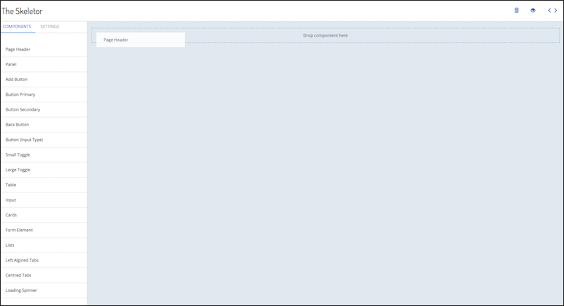
Design a Builder UI with Skeleton Creator
The Builder CLI features the Skeleton Creator tool, with which you can easily create views just by dragging and dropping UI components. Here are the steps to get started.
Open a terminal window.

Run the command
builder runSkeletonCreatorto start the Skeleton Creator. The HTTP server starts locally.- Enter the URL http://localhost:8082 in a browser. The Skeleton Creator design interface will appear.
To design a view, drag and drop the components from the left of the screen onto the main screen. Organize the components as they should appear in the Builder UI.
After you create the view, click the preview button to the right of the delete button. The browser immediately stores your view in the local cache. That means you will not loose the view until you delete it by explicitly clicking on the delete button.

Export the code that the Skeleton Creator generates by clicking on the show button to the right of the preview button.
Here is an example of a UI with its corresponding code preview:

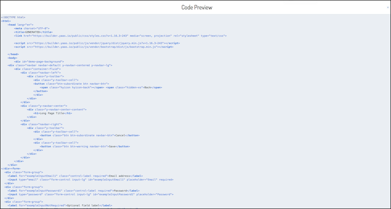
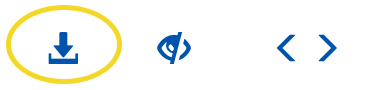
If you are using Chrome or Firefox, a download button is available in preview mode allowing you to download the code to a file.
Internet Explorer and Safari do not support the download button. Instead, you can copy the HTML code directly from the broswer.
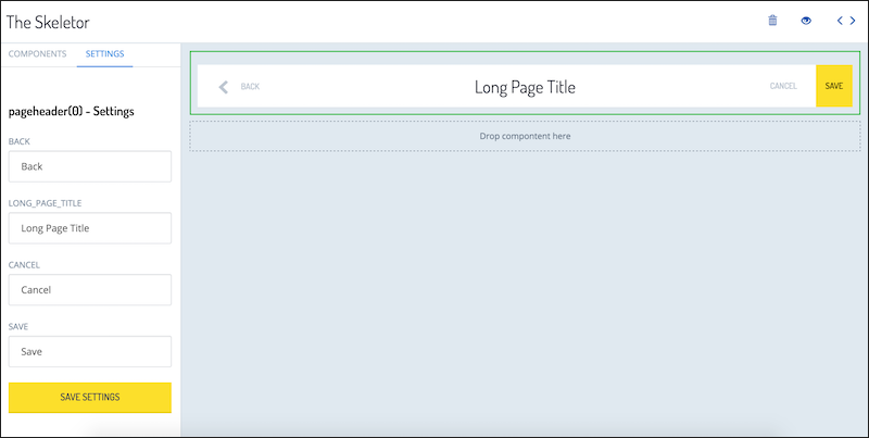
Component settings
You can adjust the settings for each component in the Skeleton Creator. This allows you to assign custom text and and labeling to the component. For example, the Page Header component features a Back button, a long page title, as well as a Save and Cancel button by default. You can set the default text of the title and rename each of the buttons.
Dev Mode to preview your module
Now that you have created your builder module, you can enable Developer Mode. After enabling this mode, link the Builder to your local module that you created in the last section. This connection makes it possible to begin previewing the HMTL and adding navigation nodes to your module directly in the Builder. You cannot yet call APIs.
Enable Developer Mode
To enable Developer Mode take the following steps:
- Navigate to the project home page and click Development.
- Switch Developer Mode on. A dark gray action bar appears at the bottom of the screen from which you can access Settings or exit Developer Mode.
- Click Settings on the action bar.
- To show the locally developed Builder module, switch on the toggle Show local module.
- Enter the URL that points to your module that is running locally. For example,
https://localhost:8081/builder/module.json - The module is now available for preview. You can begin to develop and test your module in Developer Mode.
Test the behavior of your module
By switching the scopes of the module on and off, you can test the behavior of your module at various levels of authorization. Access the scopes of your local module by opening Settings from the gray action bar. Under Scopes you can use the toggles to turn the various scopes on and off.
Integrate a Builder module
The Builder is a tool in which you can manage your account, projects, services, clients, and packages. It is also a container in which you can integrate your own Builder module to manage your services. The Builder module must be an HTML-based view registered with a package providing the URL pointing to the module.
Module descriptor
The Builder module is defined in a JSON file. Its structure is made out of JSON objects that outline the module's properties. It's built out of widgets whose purpose, form, and functionality can differ within a single Builder module. Here are a few rules to keep in mind when creating the module.json file:
- There are several meanings of the widgets in the Builder modules: enriching navigation, specifying settings, and translating modules into different languages.
- You can adjust the settings to your needs in the Builder module, but the viewUrl setting is required.
- You can create widgets of various types according to your needs, including arrays, objects, strings and booleans.
Here is the full schema of the module.json file in extendable code snippet:
Each object is defined separately and independently in the module descriptor. This is an example of the module.json file:
{
      "widgets": [
          {
              "id": "wishlist#1",
              "title": "Wishlist",
              "settings": {
                  "description": "Main widget for the Wishlist.",
                  "viewUrl": "/#!/wishlist/",
                  "required": true
              }
          },
          {
              "id": "wishlist#2",
              "title": "Wishlist Details",
              "settings": {
                  "viewUrl": "/#!/administration/details/"
              }
          },
          {
              "id": "wishlist#3",
              "title": "Wishlist Settings",
              "settings": {
                  "viewUrl": "/#!/administration/settings/"
              }
          },
          {
              "id": "wishlist#4",
              "title": "Favorite Wishlists",
              "settings": {
                  "viewUrl": "/#!/administration/favourite/"
              }
          }
      ],
      "translations":{
          "en" : {
              "wishlist#1" : "Wishlist",
              "wishlist#2" : "Wishlist Details",
              "wishlist#3" : "Wishlist Settings",
              "wishlist#4" : "Favourite Wishlists"
          },
          "de" : {
              "wishlist#1" : "Wunschliste",
              "wishlist#2" : "Wunschliste Angaben",
              "wishlist#3" : "Wunschliste Einstellungen",
              "wishlist#4" : "Liebling Wunschlisten"
          }
      }
}
The purpose of the widgets and translations in the previous example is described below:
- widgets - Define the navigation structure using this object. The process of building the navigation sub-tree is described in the next section.
- translations - Specify the language used in the Builder module. Currently, hybris supports English and German translations.
Customize the module descriptor as you like by adding more widgets to the existing structure. You can also specify more than one view for each widget without creating an HTML file for every widget. Resources like JavaScript files are loaded separately for each widget and displayed as unique iframes.
Navigation in the Builder module
You can modify the navigation inside the Builder module by defining the object widgets. Initially, the Builder module consists of one navigation tree. All of the entries are at the same level. However, you can create sub-tree navigation by adding the perspectiveDomain fields inside the widget. For example:
{
  "widgets": [
      {
          "id": "wishlist#1",
          "title": "Wishlist",
          "settings": {
              "description": "Main widget for the Wishlist.",
              "viewUrl": "/#!/wishlist/",
              "required": true
          }
      },
      {
          "id": "wishlist#2",
          "title": "Wishlist Details",
          "settings": {
              "viewUrl": "/#!/administration/details/",
              "perspectiveDomain": "Wishlist Administration"
          }
      },
      {
          "id": "wishlist#3",
          "title": "Wishlist Settings",
          "settings": {
              "viewUrl": "/#!/administration/settings/",
              "perspectiveDomain": "Wishlist Administration"
          }
      }
    ]
}
As a result, two navigation entries are displayed in the main navigation tree: Wishlist and Wishlist Administration. By nesting the second and third widget in the first one, a sub-tree is created with two navigation entries, called Wishlist Details and Wishlist Settings.
Ordering of navigation nodes
The navigation nodes represented by widgets in the module.json are displayed in the order specified in that file. This is true for navigation nodes of a single Builder module. If you want to control the order of navigation nodes within two or more Builder modules, use the sortingKey attribute. All navigation nodes in one level are sorted alphabetically by the sortingKey attribute. Imagine a project where these two Builder modules are included:
Module A:
{
      "widgets": [
          {
              "id": "wishlist#1",
              "title": "Wishlist",
              "settings": {
                  "description": "Main widget for the Wishlist.",
                  "viewUrl": "/#!/wishlist/"
              }
          },
          {
              "id": "wishlist#2",
              "title": "Wishlist Details",
              "settings": {
                  "viewUrl": "/#!/administration/details/"
              }
          },
          {
              "id": "wishlist#3",
              "title": "Wishlist Settings",
              "settings": {
                  "viewUrl": "/#!/administration/settings/"
              }
          },
          {
              "id": "wishlist#4",
              "title": "Favorite Wishlists",
              "settings": {
                  "viewUrl": "/#!/administration/favourite/"
              }
          }
      ]
}
Module B:
{
      "widgets": [
          {
              "id": "product_list",
              "title": "Products",
              "settings": {
                  "description": "Lists all products.",
                  "viewUrl": "/products/list.html"
              }
          },
          {
              "id": "product_details",
              "title": "Product Details",
              "settings": {
                  "viewUrl": "/products/details.html"
              }
          },
          {
              "id": "product_settings",
              "title": "Product Settings",
              "settings": {
                  "viewUrl": "/products/settings.html"
              }
          }
      ]
}
The navigation tree will then have these nodes in this order:
    Wishlist
    Wishlist Details
    Wishlist Settings
    Favorite Wishlists
    Products
    Product Details
    Product Settings
If you want the wishlist-related navigation nodes placed after the product-related nodes, you can make use of the sortingKey attribute and change the module.json definitions of these modules, as shown in the following example:
Module A:
{
      "widgets": [
          {
              "sortingKey": "wish.01",
              "id": "wishlist#1",
              "title": "Wishlist",
              "settings": {
                  "description": "Main widget for the Wishlist.",
                  "viewUrl": "/#!/wishlist/"
              }
          },
          {
              "sortingKey": "wish.02",
              "id": "wishlist#2",
              "title": "Wishlist Details",
              "settings": {
                  "viewUrl": "/#!/administration/details/"
              }
          },
          {
              "sortingKey": "wish.03",
              "id": "wishlist#3",
              "title": "Wishlist Settings",
              "settings": {
                  "viewUrl": "/#!/administration/settings/"
              }
          },
          {
              "sortingKey": "wish.04",
              "id": "wishlist#4",
              "title": "Favorite Wishlists",
              "settings": {
                  "viewUrl": "/#!/administration/favourite/"
              }
          }
      ]
}
Module B:
{
      "widgets": [
          {
              "sortingKey": "prod.01",
              "id": "product_list",
              "title": "Products",
              "settings": {
                  "description": "Lists all products.",
                  "viewUrl": "/products/list.html"
              }
          },
          {
              "sortingKey": "prod.02",
              "id": "product_details",
              "title": "Product Details",
              "settings": {
                  "viewUrl": "/products/details.html"
              }
          },
          {
              "sortingKey": "prod.03",
              "id": "product_settings",
              "title": "Product Settings",
              "settings": {
                  "viewUrl": "/products/settings.html"
              }
          }
      ]
}
The resulting navigation node order in the Builder:
    Products
    Product Details
    Product Settings
    Wishlist
    Wishlist Details
    Wishlist Settings
    Favorite Wishlists
If you do not have control over both of Builder modules (one of them is created and managed by other company/provider) you can still use the sortingKey attribute in your module to place the nodes below or on top of the nodes of the other one. You just need to know the ID of the 3rd party module. To define the order of builder modules within a project, each node has a sorting key. If it is not specified in the module.json, a default sorting key is generated and used. It consists of the following elements:
- Module ID - the ID of the Builder module, as specified in the Builder
- Sequence number of the node
If the module ID is "Module A" and it is the second node from the top in the module.json file, its default sorting key would be: "Module A000002". Given that you know the module ID, you can specify the navigation nodes of your module in relation to the other module using sorting keys.
Virtual children in navigation tree
The virtual children mechanism enables you to add one or more child widgets without changing the parent (the main navigation tree). You can create virtual children in the navigation tree, which is only visible in the central part of the view, but not in the left navigation. You need to define the virtual children property in the parent widget as shown in the example:
{
    "widgets": [
        {
          "id": "wishlist#1",
          "title": "Wishlist",
          "virtualChildren":true,
          "settings": {
              "description": "Main widget for the Wishlist.",
              "viewUrl": "/#!/wishlist/",
              "required": true
          },
          "widgets": [
              {
                  "id" : "product1",
                  "title" : "Product1",
                  "settings" : {
                      "viewUrl":"productDetails.html"
                  }
              }
          ]
        }
    ]
}
In order to navigate to the child widget, use the link manager.
Builder.linkManager().currentLocation().path('/product1').open();
Dynamic nodes in navigation tree
In the Builder, you can use parametrized views using dynamic nodes.
An example of the use of dynamic nodes in the Builder is in the Projects > Your Project > Services > Service Details view. Each service in a project gets its own node in the navigation tree based on the service id.
Following is an example of widget configuration:
{
    "widgets": [
        {
            "id": "wishlist#1",
            "title": "Wishlist",
            "virtualChildren":"true",
            "settings": {
                "description" : "Main widget for the Wishlist.",
                "viewUrl": "/#!/wishlist/",
                "example_setting": "some value"
            },
            "widgets": [
                {
                    "id": "dynamicNodeExample",
                    "title": "dynamicNode example",
                    "dynamic":"productId",
                    "settings": {
                        "viewUrl": "productDetails.html",
                        "example_setting": "some value"
                    }
                }
            ]
        }
    ]
}
The dynamic node is written in the URL using the Link manager, as shown in the example:
Builder.linkManager().currentLocation().path($scope.productId).open();
In the target view, you can take the dynamic node value by reading the settings from your current widget from the example:
$scope.product = Builder.currentWidget.settings.productId;
Dynamic parameters as part of the view URL
If a dynamic parameter, like productId, is part of your view URL, you can express it, as well. For example, if the Product Details view is programmed to get the product ID as a URL query parameter, you can configure the widget as shown in the following example (see the viewUrl field of the child widget):
{
    "widgets": [
        {
            "id": "wishlist#1",
            "title": "Wishlist",
            "virtualChildren": "true",
            "settings": {
                "description": "Main widget for the Wishlist.",
                "viewUrl": "/#!/wishlist/",
                "example_setting": "some value"
            },
            "widgets": [
                {
                    "id": "dynamicNodeExample",
                    "title": "dynamicNode example",
                    "dynamic": "productId",
                    "settings": {
                        "viewUrl": "productDetails.html?product={productId}",
                        "example_setting": "some value"
                    }
                }
            ]
        }
    ]
}
In this example, the {productId} expression is replaced by the real value of the parameter, the same one you get as a setting. The dynamic parameter can be in any part of the view URL.
Nested dynamic parameters
A widget with a dynamic parameter does not necessarily have to be a leaf widget. It can have child widgets, and those can have dynamic parameters, as well. However, there can only be one widget with a dynamic parameter for each navigation level.
builder createModule YOUR_MODULE_NAME command in the command line in the Builder root folder.Translate your Builder module
You can customize the language within your Builder module according to the project's needs. English and German languages are currently available. You can add the translations to the Builder module as shown in the example module.json file:
{
    "translations": {
        "en": {
            "wishlist#1": "Wishlist",
            "wishlist#2": "Wishlist Details",
            "wishlist#3": "Wishlist Settings",
            "wishlist#4": "Favourite Wishlists"
        },
        "de": {
            "wishlist#1": "Wunschliste",
            "wishlist#2": "Wunschliste Angaben",
            "wishlist#3": "Wunschliste Einstellungen",
            "wishlist#4": "Liebling Wunschlisten"
        }
    }
}
In the example above, wishlist#2 is the widget that you want to translate, and Wishlist Details is the title of this widget.
Cross-origin resource sharing in the Builder
Builder modules are loaded and processed by the Builder on the client side. Therefore, enable the access to the module descriptor in the module.json file of your Builder module from a specified origin. For example, http://builder.yaas.io or http://*.yaas.io are configured to load Builder modules.
Provide valid CORS headers in the web server. Otherwise, the Builder module is not loaded.
If you are using the Cloud Foundry static file buildpack, take advantage of the example configuration:
worker_processes 1;
daemon off;

error_log <%= ENV["APP_ROOT"] %>/nginx/logs/error.log;
events { worker_connections 1024; }

http {
  log_format cloudfoundry '$http_x_forwarded_for - $http_referer - [$time_local] "$request" $status $body_bytes_sent';
  access_log <%= ENV["APP_ROOT"] %>/nginx/logs/access.log cloudfoundry;
  default_type application/octet-stream;
  include mime.types;
  sendfile on;
  gzip on;
  tcp_nopush on;
  keepalive_timeout 30;
  port_in_redirect off;

  server {
    listen <%= ENV["PORT"] %>;
    server_name localhost;

    location / {
      root <%= ENV["APP_ROOT"] %>/public;
      index index.html index.htm Default.htm;
      <% if File.exists?(File.join(ENV["APP_ROOT"], "nginx/conf/.enable_directory_index")) %>
      autoindex on;
      <% end %>
      <% if File.exists?(auth_file = File.join(ENV["APP_ROOT"], "nginx/conf/.htpasswd")) %>
      auth_basic "Restricted";
      auth_basic_user_file <%= auth_file %>;
      <% end %>
      <% if ENV["FORCE_HTTPS"] %>
      if ($http_x_forwarded_proto = http) {
        return 301 https://$host$request_uri;
      }
      <% end %>

      if ($request_method = 'OPTIONS') {
        add_header 'Access-Control-Allow-Origin' '*';
        add_header 'Access-Control-Allow-Credentials' 'true';
        add_header 'Access-Control-Allow-Methods' 'GET, POST, OPTIONS';
        add_header 'Access-Control-Allow-Headers' 'DNT,X-CustomHeader,Keep-Alive,User-Agent,X-Requested-With,If-Modified-Since,Cache-Control,Content-Type';
        add_header 'Access-Control-Max-Age' 1728000;
        add_header 'Content-Type' 'text/plain charset=UTF-8';
        add_header 'Content-Length' 0;
        return 204;
      }
      if ($request_method = 'GET') {
        add_header 'Access-Control-Allow-Origin' '*';
        add_header 'Access-Control-Allow-Credentials' 'true';
        add_header 'Access-Control-Allow-Methods' 'GET, POST, OPTIONS';
        add_header 'Access-Control-Allow-Headers' 'DNT,X-CustomHeader,Keep-Alive,User-Agent,X-Requested-With,If-Modified-Since,Cache-Control,Content-Type';
      }
    }
  }
}
The CORS configuration from the code snippet above is valid for basic authorization. Ensure that the redirect URIs don't include the internal container PORT - <%= ENV["PORT"] %>. Add the code to the nginx.conf file in the root folder of the Builder module. It is automatically detected and used by the buildpack. You can modify the configuration according to your needs. This default configuration enables access from all instances of the origin to any resource of the Builder module using GET or POST requests on the client side.
An alternative way to load the Builder module descriptor
Should it not be possible to configure your environment to provide CORS headers with the module.json resource, you can instead use an alternative option that does not require CORS headers. Instead of JSON, provide an HTML resource. The module descriptor URL should look like this:
https://my.builder.module/builder/module.html
Your module.html needs to contain a piece of code that sends the module JSON as a string to the parent window using the window.postMessage JavaScript function. This message will be received and the module descriptor processed by the Builder.
Here is an example of such a module.html:
<html><head></head><body><script>

var moduleDescriptor = {
    "widgets": [
      {
          "id": "wishlist#1",
          "title": "Wishlist",
          "settings": {
              "description": "Main widget for the Wishlist.",
              "viewUrl": "/#!/wishlist/",
              "required": true
          }
      },
      {
          "id": "wishlist#2",
          "title": "Wishlist Details",
          "settings": {
              "viewUrl": "/#!/administration/details/"
          }
      }
    ]
};

if(window.parent) {
    window.parent.postMessage(JSON.stringify(moduleDescriptor), "*");
}

</script></body></html>
It is absolutely essential that the JSON will be sent to the parent window using window.postMessage, and not just included in the HTML - otherwise the module descriptor will not be loaded.
View
The view must be HTML-based and can use any technology. The integration point is based on an HTML5 window.postMessage file and JavaScript. AngularJS is also supported if your view is AngularJS-based.
Static resources
A set of static resources is provided by hybris, such as CSS styles and JavaScript libraries. These resources are hosted at https://builder.yaas.io/public/. For example:
    <link href="https://builder.yaas.io/public/css/styles.css" rel="stylesheet"/>  <!-- YaaS styles -->
    <script src="https://builder.yaas.io/public/js/vendor/jquery/dist/jquery.min.js"></script>
    <script src="https://builder.yaas.io/public/js/vendor/underscore/underscore.js"></script>
    <script src="https://builder.yaas.io/public/js/vendor/angular/angular.min.js"></script>
    <script src="https://builder.yaas.io/public/js/vendor/restangular/dist/restangular.js"></script>
    <script src="https://builder.yaas.io/public/js/vendor/bootstrap/dist/js/bootstrap.min.js"></script>
Builder context
For the view to render properly, the most important task is to get the Builder context. It contains the current account ID, project ID, authorization token, and widget settings. Include https://builder.yaas.io/public/js/builder.js in your view page. It contains message handling routines necessary to receive the Builder context, as well as further communication with the Builder. For example:
<script src="https://builder.yaas.io/public/js/builder.js"></script>
Initialization
The initial context is passed to the module view using window.postMessage where the view is rendered. The incoming message is handled by the builder.js file. Note that everything is dependent on the Builder context, such as current account ID, project ID, authorization token, and widget settings. Render the view after the Builder context has been initialized. You can register a callback function to be notified that the context is ready using Builder.initialize(callbackFunction);. For example:
<script>
Builder.initialize(function(){
    $("#header").append("Welcome " + Builder.currentAccountId + "!");
    $("#settings").append(JSON.stringify(Builder.currentWidget));
    $("#location").append(Builder.currentLocation);
});
</script>
Builder context variables
All context variables are properties of the global JavaScript object called Builder. This object is created and includes proper values after the Builder context initialization phase.
| Variable | Description |
|---|---|
| Builder.currentAccountId | Account ID (email) of the current user |
| Builder.currentProjectId | Current project ID |
| Builder.currentProjectLocales | List of locales configured for the current project |
| Builder.currentWidget.settings | Settings provided in your module descriptor for the current view |
| Builder.authManager | Authentication manager, contains authorization-related functionality |
| Builder.notificationManager | Notification manager, contains notification-related functionality |
| Builder.notificationConfig | Notification configuration settings |
| Builder.linkManager | Link manager, contains navigation-related functionality |
Translation using the Builder.currentLanguage context variable
| Variable | Description |
|---|---|
| Builder.currentLanguage | Indicates the current language set in the Builder module |
Use the context variable currentLanguage to determine the current language set for the Builder module. Based on the information that this variable provides, developers select localized content that they have previously configured using the technology of their choice.
Example:
1. Declare the context variable currentLanguage for the application scope.
<script>

 var demoUIModuleApp = angular.module('demoUIModuleApp', ["builder", "builder.translate"]);

 demoUIModuleApp.controller('settingsCtrl', function($scope, $http) {
  $scope.currLanguage = Builder.currentLanguage;
 });

</script>
2. Include the directive in the view that binds to the controller. In this case, ng-controller.
<div class="panel-body" ng-controller="settingsCtrl">
3. Create a directory called locales. In this directory create a JSON file for each language that you would like to translate. In this example, there is a file for German and English. The file containing German content has a name such as locale_de.json with this notation:
{

    "SHOWCASE":{
        "DEFAULT_BUTTON" : "Hier Klicken",
        "EXAMPLE_TRANSLATION" : "Beispieluebersetzung",
        "CURRENT_LANGUAGE" : "Aktuelle Sprache"
    }
}
4. Nest the translation keys into the view at the location where the ng-controller directive appears.
<div class="panel-body" ng-controller="settingsCtrl">
 <div>
  {{'SHOWCASE.EXAMPLE_TRANSLATION' | translate}}
 </div>
 <div>{{'SHOWCASE.CURRENT_LANGUAGE' | translate}}: {{currLanguage}}</div>
 <div>
  <button class="btn btn-default">{{'SHOWCASE.DEFAULT_BUTTON' | translate}}</button>
 </div>
</div>
AngularJS module Restangular wrapper
If you are using AngularJS and Restangular, it is recommended that you add a dependency from the Builder module to your AngularJS modules:
var mymodule = angular.module("mymodule", ["builder"]);
This module contains pre-configured Restangular that handles YaaS-specific authorization and error handling. Every call made with Restangular is intercepted, and the authorization information is added to the request. In case of an error, the response and error notifications are intercepted.
Security
The Builder initiates the authorization process for your Builder module by passing the access token utilizing the window.postMessage mechanism to the JavaScript scope of the module. Your token is accessible using the Builder.authManager().getAccessToken() function. The Builder module only consumes and uses the access token while interacting with services.
Authorization Manager
The Builder contains a built-in authorization mechanism for REST calls coming from external Builder modules. This mechanism is based on the Restangular plug-in and uses its request and error interceptors to add access token headers to your requests, as well as to handle authorization errors. It is recommended to use Restangular because of this out-of-the-box feature. However, if this does not work for your situation, you can also use the Authorization Manager to implement custom authorization for your Builder module.
The Authorization Manager is a JavaScript object designed for authorization-related purposes.
| Function | Description | Service Call Authentication |
|---|---|---|
| Builder.authManager().getAccessToken() | Gets the access token that should be used when making REST calls to services. It contains scopes based on the current user and the package to which your module is registered. | Use the function to get a valid access token and include this token in the authorization header, which is required by the request. |
| Builder.authManager().handleAuthError(navigationState, response) | Using this function, you notify the Builder that there was an authorization problem during a REST call (a 401 response code was generated), which usually means that the access token has expired. The Builder handles that example by getting a new token or by redirecting you to the login screen. | Use the function to properly handle the 401 Unauthorized response caused by the fact that your token is no longer valid. |
Notification manager
The Notification Manager allows you to show notifications in the Builder.
| Function | Description |
|---|---|
| Builder.notificationManager.showInfo(message, data) | Shows an informational message in the notification area. It automatically closes after a few seconds. Parameters:
|
| Builder.notificationManager.showSuccess(message, data) | Shows a success message in the notification area. It automatically closes after a few seconds. Parameters:
|
| Builder.notificationManager.showError(message, data) | Shows a warning message in the notification area. It remains open until you close it. Parameters:
|
| Builder.notificationManager.addNotification(notification) | Shows a message in the notification area. Parameters:
|
| Builder.notificationManager.addNotificationToCenter(notification) | Adds a message to the notification center. Parameters:
|
| Builder.notificationManager.removeNotificationFromCenter(notification) | Removes notification from the notification center. If id is provided, the notification with matching ID is removed, otherwise the notification with matching content (title, message, origin and data) is removed. Parameters:
|
| Builder.notificationManager.addNotificationGroupToCenter(idPattern, notifications) | Adds all provided notifications and removes all existing (except for the provided ones) with ID matching the provided idPattern regular expression object. Parameters:
|
| Builder.notificationManager.showConfirmation(title, message, onConfirmCallback, onCancelCallback, data) | Shows a confirmation dialog with the provided title and message. It also contains a button to confirm or to cancel. The onConfirmCallback function is called when user confirms, the onCancelCallback function is called when the user presses Cancel. Parameters:
|
| Builder.notificationManager.showModalDialog(modalConfiguration) | This function performs the same operation as the showConfirmation function but it provides all parameters with a single configuration object called modalConfiguration. It also includes more configuration possibilities than the showConfirmation function. Parameters:
|
| Builder.notificationManager.pushProcessing() | Shows a "processing" information message. If the application is already in the processing state, it increments the counter of processing requests. Use this for long-running operations. |
| Builder.notificationManager.popProcessing() | Stops showing the "processing" information, or decrements the counter for processing requests if the count is greater than one. |
| Builder.notificationManager.clearProcessing() | Stops displaying the "processing" information. |
Notification manager: The data parameter
The data parameter used in the various Notification manager functions allows you to inject additional data into the message provided as the first parameter of the function call. Currently, only the Builder links are supported as a data type.
The data parameter must be an object. You can use every property of that object as a placeholder in the message and the system replaces the placeholder with the processed value of the property.
This example demonstrates the use of the Notification manager by showing an info message that contains a link to a specified node in the Builder:
Builder.notificationManager.showInfo(
    'The new product was created succesfully. Go to {catLink} to attach it to a category.',
    {
        catLink: {type: "link", url:"/Home/org1/Projects/pro1/categories", text: "Category Management"}
    }
);
The result is this message:
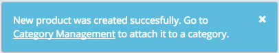
The link is clickable and navigates to the Builder path as specified in the data object. You can have more than one links or placeholders in a single message.
To build a link to a specified part of the Builder, you can use the linkManager as shown:
var url = Builder.linkManager().currentProject().path('/categories').get(); // the get method returns the Builder link as a string
Link manager
Using the Link manager, you can navigate in the Builder. Jump to a different widget or navigation entry in your module, or navigate to a different part of the Builder, such as Settings of the current project. Use the following functions to compose the link, and call Builder.linkManager.open() to navigate to the link. For example, to jump to the administration page of the current project root page, call Builder.linkManager().currentProject().path("Administration").open().
| Function | Description |
|---|---|
| Builder.linkManager().path(link) | Sets the last part of the link that comes after currentLocation, and currentProject, if they are specified. |
| Builder.linkManager().currentLocation() | Sets the first part of the link to the current location, the path specified by path(...). The path is relative to the current location. |
| Builder.linkManager().currentProject() | Sets the first part of the link to the current project, the path specified by path(...). The path is relative to the current project node, if it exists. |
| Builder.linkManager().open(addToHistory, callback) | Navigates to the link as composed using the previous functions. Parameters:
|
| Builder.linkManager().get() | Gets the link composed using the previous functions as a string. |
| Builder.linkManager().exists() | Checks if the specific node is present in the project. The result is given as a {boolean} flag. The value is true if the link in the navigation already exists. |
| Builder.linkManager().addReferrer() | Stores a short history of user actions by adding the link to the previous location in the open link. The link is returned as a {string}. |
| Builder.linkManager().getReferrer() | Gets the reference to the previous location. Based on that you can implement different behaviour depending on where your view got navigated from. |
| Builder.linkManager().hasBack() | Returns true if the previous view was added to the history and it is possible to navigate back to it using Builder.linkManager().goBack(). |
| Builder.linkManager().goBack(data) | Navigates to the previous view if it was added to the history. Use Builder.linkManager().goBack() to check if it is possible. Parameters:
|
| Builder.linkManager().encodeValue(data) | Use Builder.linkManager().encodeValue() to encode special characters in the link, for example, in dynamic nodes. Parameters:
|
| Builder.linkManager().decodeValue(data) | Use Builder.linkManager().decodeValue() to decode special characters in the link, for example, in dynamic nodes. If Builder.linkManager().encodeValue() was used to encode a fragment of a link with special characters, the decode function must have been called to decode this fragment of the link. Parameters:
|
Help mode
Help mode is an optional functionality in the Builder which activates hints for specific fields of the Builder module. Help mode can be turned on and off in the Builder, at the bottom of the navigation bar. To implement help mode in your UI module, follow the example below:
If you want to implement help mode in your Builder module:
.js file, add the following code snippet:<script>
Builder.applyHelpMode($scope);
</script>
ng-if attribute in your view .html file so that it is visible only when the help mode is turned on. The example contains the recommended styling class class="builder-help-text inline-hint-text" for help mode:<script>
<span ng-if="helpMode" class="builder-help-text inline-hint-text"> This text will be displayed if you turn on Help Mode in the Builder.</span>
</script>
Fullscreen mode
You can enable the option to view your Builder module in fullscreen mode, in which the Builder module fills the entire viewing area of your screen. Instructions for enabling and disabling the fullscreen mode option, as well as exiting fullscreen mode when it is enabled, follow.
When the fullscreen mode option is enabled, you can exit fullscreen by hovering your cursor at to the top of your Builder module screen. Your cursor changes in appearance and an exit bar appears. Click the exit bar to quit fullscreen mode.
To enable or disable the fullscreen mode option in your Builder module, use these functions:
| Function | Description |
|---|---|
| Builder.moduleFullScreen.turnOn() | Turn on fullscreen mode to display the Builder module in the full viewing area of your screen. |
| Builder.moduleFullScreen.turnOff() | Disable fullscreen mode to display the Builder Module only within the Builder window. |
| Builder.moduleFullScreen.isOn() | Verify whether fullscreen mode is activated. |
The localized editor component in the Builder
The localized editor is a custom Angular directive in builder_editors with a dependency to the builder.
Configure the localized editor
As a Builder module developer, complete a few simple tasks:
- Include one of these files:
https://builder.yaas.io/public/js/builder_editors.jshttps://builder.yaas.io/public/js/builder_editors_v2.js - Then, add the builder_editors module to your Angular module.
The directive expects data formatted as shown in this example:
  /*simple string with localized property label */
  $scope.localizedLabel = 'Demo Label';

  /*array of json objects containing language iso and localized value of property*/
  $scope.localizedData = [
      {iso: 'en', value: 'english text'},
      {iso: 'de', value: 'german text'},
      {iso: 'pl', value: 'polish text'}];
Since version 2 of the builder_editors structure of localized data has been changed, the localized editor accepts data in example format:
  /*json object containing language iso and localized value of a property*/
  $scope.localizedData = {
      'en': 'english text',
      'de': 'german text',
      'pl': 'polish text'};
Remember that a list of languages (currencies) in which the property is localized has to match the list of defined languages (currencies) for the current user.
- HTML markup
<div class="panel-body"> <h3>Single Line</h3> <localized-text-editor data="localizedData" ng-form="someName2" builder-locale-type="currencies"></localized-text-editor> </div>languagesorcurrencies, respectively. This attribute is required for a localized editor component. Avoid any configuration that will render your code invalid. For example, a multi-line currency editor is an example of configuration that is not supported. The builder-editor-type attribute defines the type of editor. If it is empty, that indicates a single-line editor. If it contains a tab, that indicates a multi-line editor with tabs for languages. For the multi-line editor, you can specify the number of rows using the builder-editor-rows attribute. The localizedData object is passed on the data attribute, and the localized field label is passed with the label attribute.
Validate the localized editor
To validate your localized editor, add the builder-validate-required-languages attribute, set as true, to the definition of a localized editor. The system validates each value.
There are two warning indicators used in the validation process:
- On the load view, warning indicators are highlighted in orange if one or more required fields are empty. This stage is implemented out of the box if you apply localized editor validation.
- Optionally, you can broadcast the following inside your controller to add one more validation stage:
js $rootScope.$broadcast($scope.someName2.$name + '-validate-on-save');
In this second stage, when user tries to save or publish the item and there are required text boxes that are still empty or filled incorrectly, your localized editor is re-validated. The event is broadcast and both indicators turn red.
Customize the localized editor (introduced with version 2)
The builder-locales lets you inject your own configuration of languages. This functionality lets you implement custom validation scenarios for specific cases. Be aware that configuration of locales for the current user is the default configuration for the localized editor. It can be overridden by injecting the following object:
    /*json object containing language iso as key and configuration as value*/
    $scope.configuration = {
        'en': {'default': true, 'required': true},
        'de': {'default': false, 'required': false}
        };
HTML markup:
    <div class="panel-body">
        <h3>Single Line</h3>
        <localized-text-editor data="localizedData" builder-locales="configuration" ng-form="someName2" builder-locale-type="currencies"></localized-text-editor>
    </div>
Implementation Guide for the Builder Editor Module version 3
This brief how-to guide uses version 3 of the builder_editors module (builder_editor_v3.js) to outline the necessary implementation steps. This page serves as an addition to the existing documentation for versions 1 and 2.
- Include the Builder module: https://builder.yaas.io/public/js/builder_editors_v3.js
- Add the builder_editors module to your Angular module.
Prepare the configuration:
$scope.configuration = {
  'en': {'default': true, 'required': true},
  'de': {'default': false, 'required': false}
 };
Specify the data to display in the element.
Example:
 $scope.localizedData = {
  'en': 'english text',
  'de': 'german text',
};
Modify your HTML to include the editor with its corresponding attributes.
Example:
 <div class="panel-body">
  <h3>Single line</h3>
  <builder-tab-editor builder-locales="configuration" data="localizedData" ng-form="someName2" ></builder-tab-editor>
 </div>
Attributes:
- data - Required. Indicates which text fills the editor prior to user input.
- builder-validate-tabs - Not required. The default value is false. Specifies whether a field should be validated or is required in order to save.
- builder-locales - Specifies which locale is the default and/or must be filled-
Validating the Builder tab editor
To allow validation in the editor:
- Add the builder-validate-tabs attribute to the definition of the editor.
- Set the attribute to
true. The system validates each value.
Draft and dirty state handling in the Builder
You can react on unsaved states in the Builder module you are developing using draft and dirty state handling in the Builder. This helps to prevent data loss and improve the user experience in the Builder. Draft and dirty state handling are two different terms, but they are interrelated:
- You can implement dirty state handling without draft handling.
- In order to implement draft handling, you need to set the dirty flag first.
In this guideline, you can learn more about implementing draft and dirty state handling in your Builder module.
Set a dirty flag
Set a dirty flag for all the places where a user can change the state in your Builder module. By doing this, you prevent data loss. The following example demonstrates how to set a dirty flag properly:
Builder.notificationManager.markDirty(true);
The following example demonstrates how to set a dirty flag for an AngularJS form:
    $scope.$watch("form.$dirty", function(isDirty) {
        Builder.notificationManager.markDirty(isDirty);
    });
If the dirty flag is set to true and the user wants to leave a page, they receive a modal confirmation dialog about a possible data loss from the Builder side.
Handle drafts
Draft handling in the Builder enables you to react on user unsaved states. If you turn on draft handling in your Builder module, users can leave a page marked as dirty and come back later without losing data. When the user returns, the Builder sends a message to ask if they want to continue editing the previously unsaved draft or not.
To enable draft handling, you must specify exactly the place and data in the Builder for which the functionality should work. After loading data/state, add a DraftHandler as shown in the example:
Builder.notificationManager.addDraftHandler([DraftOptionsA, DraftOptionsB, ...], DraftHandlerCallback);
You can only add one DraftHandler per view. For each draft you want to save, you must pass a DraftOptions object which must include the following properties:
- id - The ID of the draft that should be saved.
- ref - A local reference to an object meant to be a draft.
- props - The properties of the reference to the object which will be saved.
- DraftHandlerCallback - If the user confirms that they want to continue editing their unsaved state, a function is called with the draft object. The draft object creates a sub-object with the ID as the name of the draft that has the properties defined in props.
Example implementation
    var currentStateObject = {
        firstname : "Flappy",
        lastname : "Swinka"
    };

    Builder.notificationManager.addDraftHandler([{"id":"myDraftIdForMyUiModule", "ref": currentStateObject,"props":["firstname", "lastname"]}], function(draft) {
        currentStateObject.firstname = draft.myDraftIdForMyUiModule.firstname;
        currentStateObject.lastname = draft.myDraftIdForMyUiModule.lastname;

        Builder.notificationManager.markDirty(false);

        /* Other things you have to do to apply a draft to your current Builder module state
        e.g. for AngularJS you have to digest the scope since we're in an asynchronous callback :

        $scope.$digest();
        or
        $scope.$apply();

        */
    });
Visibility Restrictions in the Builder
The Builder module is a UI client application that uses access tokens to call YaaS services. After a user logs in and selects a project, they can open a Builder module that will call services on their behalf. An access token is issued for the module, representing the Builder module's authority to perform actions on behalf of the current user within the selected tenant. The scope of those actions depends on the required scopes declared by the Builder module itself and on the user roles the current user has for the given project.
The set of scopes that the Builder module can perform on behalf of the current user within the current project is called effective scopes.
Based on the set of effective scopes, you can influence the visibility of elements in your module depending on user permissions.
For example, if a DELETE WISHLIST button in your module should trigger a DELETE request that is allowed only for members whose roles contain the hybris.wishlist_delete scope, you can hide the button for members with roles that don't include such scope.
The following tutorial describes how to use effective scopes to hide whole navigation nodes, hide specific components, or show form elements in read-only mode.
Visibility restriction of nodes in navigation tree
If you want one of your nodes to only be visible to project members with certain permissions (perhaps because the view requires these permission in order to work properly), you can do that by setting the scopes property.
Widget configuration is shown in the example:
{
    "widgets": [
        {
            "id": "wishlist#1",
            "title": "Wishlist",
            "virtualChildren":"true",
            "settings": {
                "description" : "Main widget for the Wishlist.",
                "viewUrl": "/#!/wishlist/",
                "example_setting": "some value"
            },
            "scopes" : [
                "hybris.wishlist_view" , "hybris.wishlist_manage"
            ],
            "widgets": [
                {
                    "id": "dynamicNodeExample",
                    "title": "dynamicNode example",
                    "dynamic":"productId",
                    "settings": {
                        "viewUrl": "productDetails.html",
                        "example_setting": "some value"
                    }
                }
            ]
        }
    ]
}
In this example, the wishlist#1 node (and its subnodes) is only visible for project members with roles containing the hybris.wishlist_view or hybris.wishlist_manage scopes.
Display or hide Components
Using the scoped actions, you can display or hide view components depending on what scopes the current user has, which improves the user's experience in the Builder.
In this guideline, you can learn more about how to use scoped actions in your Builder module.
Import the file
In order to use the scoped actions functionality, you need to import the componentRestrictions.js file:
<script src="https://builder.yaas.io/public/js/componentRestrictions.js"></script>
The componentRestrictions.js file introduces the builder.componentRestrictions module, which you need to include as a dependency in your Angular module.
var myBuilderModuleApp = angular.module('myBuilderModuleApp', ["builder", "builder.componentRestrictions"]);
Use the directive
The easiest way to use this is to use the if-actions-allowed directive. For example, if you have an action button that deletes a wishlist item:
<button ng-click="deleteWishlistItem()">Delete</button>
This button should only be shown if the user that is currently signed in has the right to delete a wishlist item. This usually means that the user must have a certain scope, such as hybris.wishlist_delete. You can express it using the if-actions-allowed directive:
<button if-actions-allowed="hybris.wishlist_delete" ng-click="deleteWishlistItem()">Delete</button>
You can also use more than one scope and use logical operators to create more complex conditions like this:
<button if-actions-allowed="hybris.wishlist_delete || hybris.wishlist_manage" ng-click="deleteWishlistItem()">Delete</button>
In this case, the user that has any of the specified scopes (hybris.wishlist_delete or hybris.wishlist_manage, in this example) can delete a wishlist item.
You can use these logical operators:
- && - logical AND
- || - logical OR
- brackets - to group sub-expressions to build even more complex expressions like: '(scope1 && scope2) || scope3'
Use the service
In your controller, you can inject the scopedActionsSrv service and do a scope-based check like this:
myApp.controller('myCtrl', function($scope, scopedActionsSrv){
        if(scopedActionsSrv.isActionAllowed('hybris.wishlist_delete')) {
            // allowed
            ...
        } else {
            //not allowed
            ...
        }
        ...
    });
Display 'read-only' elements
If you want to show read-only form inputs, depending on the current token restrictions, or any custom condition, you can use editable directive. Editable element allows you to restrict modification of children elements. For example :
<editable having="hybris.wishlistitem_manage" unless="{{wishlistItem.status === 'BLOCKED'}}">
   <div class="col-sm-6 col-xs-12">
        <div class="form-group">
            <label for="wihlistItemName" class="control-label">Name *</label>
            <input type="text"
                   class="form-control input-lg"
                   id="wihlistItemName"
                   ng-model="wishlistItem.name" name="Wishlist Item Name" required/>
        </div>
        <div class="form-group">
            <div class="checkbox">
                <input type="checkbox" id="wihlistItemActive" ng-model="wishlistItem.active">
                <label for="wihlistItemActive" class="control-label">Active</label>
            </div>
        </div>
    </div>
</editable>
Only users bearing access token with the hybris.wishlistitem_manage scope can modify wishlist items, unless the item is BLOCKED. In other words, if the status of wishlist item is BLOCKED or, the user has no hybris.wishlistitem_manage scope within his access token, the input will be transformed into a paragraph element and the check box will be disabled and rendered in read-only mode.
Similarly to the if-actions-allowed directive, you can combine scopes in the having attribute using logical operators.
Alternatively, you can use editable-for-actions directive. This directive relies only on the access token restrictions. So you wouldn't be able force read-only mode depending on the wishlist item status.
The example using editable-for-actions directive would look as follows:
<form role="form" name="editWishlistItemForm" editable-for-actions="hybris.wishlistitem_manage">
    <div class="col-sm-6 col-xs-12">
        <div class="form-group">
            <label for="wihlistItemName" class="control-label">Name *</label>
            <input type="text"
                   class="form-control input-lg"
                   id="wihlistItemName"
                   ng-model="wishlistItem.name" name="Wishlist Item Name" required/>
        </div>
        <div class="form-group">
            <div class="checkbox">
                <input type="checkbox" id="wihlistItemActive" ng-model="wishlistItem.active">
                <label for="wihlistItemActive" class="control-label">Active</label>
            </div>
        </div>
    </div>
</form>
Here, you can also combine scopes using logical operators. You can apply editable-for-actions directive on a single input elements. For example:
<input type="text"
       class="form-control input-lg"
       id="wihlistItemName"
       ng-model="wishlistItem.name" name="Wishlist Item Name" required
       editable-for-actions="hybris.wishlistitem_manage"/>
Two modes of processing of 'read-only' elements
For the editable and editable-for-actions directives a mode can be specified that controls how read-only elements are rendered. These two modes are possible:
- replace - this is default and applies also when you do not specify any mode. It turns all input elements into paragraph elements with the input value as text content.
- disable - sets all input elements to readonly and disabled.
In this example the disable mode is used:
<editable having="hybris.wishlistitem_manage" mode="disable">
   <div class="col-sm-6 col-xs-12">
        <div class="form-group">
            <label for="wihlistItemName" class="control-label">Name *</label>
            <input type="text"
                   class="form-control input-lg"
                   id="wihlistItemName"
                   ng-model="wishlistItem.name" name="Wishlist Item Name" required/>
        </div>
        <div class="form-group">
            <div class="checkbox">
                <input type="checkbox" id="wihlistItemActive" ng-model="wishlistItem.active">
                <label for="wihlistItemActive" class="control-label">Active</label>
            </div>
        </div>
    </div>
</editable>
Client-side field validation in the Builder
The builder.inputs Angular module provides a mechanism for client-side field validation. The builder.inputs module contains the builder-input Angular directive, which allows you to validate any input or text area field.
In this document, you will learn more about client-side field validation in your Builder module.
To begin, you must:
- Include the https://builder.yaas.io/public/js/builderInputs.js file using the script:
<script src="https://builder.yaas.io/public/js/builderInputs.js"></script>
Keep in mind that builder.inputs uses the angular-translate module internally to provide localized error and help messages. If you don't use it in your Builder module, you will need to include two additional files before builderInputs.js:
    <script src="https://builder.yaas.io/public/js/vendor/angular-translate/angular-translate.js"></script>
    <script src="https://builder.yaas.io/public/js/vendor/angular-translate-loader-static-files/angular-translate-loader-static-files.js"></script>
- Add builder.inputs to your module as shown:
var wishlistItem = angular.module("wishlistItem", ["builder.inputs"]);
- Inject inputValidator service into your controller as shown:
wishlistItem.controller('wishlistItemController',
    ['$scope', 'inputValidator',function ($scope, $timeout) {}]);
Validation rules
The builder-input attribute enables you to specify one of following validation rules:
- url - a web address starting with http, ftp, or https
- secureUrl - a web address starting with https
- email - an email address
- restrictedName - only digits and letters are valid
- noRestriction - all characters are valid
- decimal - a decimal value
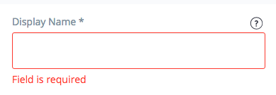
The builder-input attribute works with the required attribute, which prevents the user from saving without providing mandatory data.
Triggering validation
Validation is triggered automatically after the user leaves the field, or as soon as the user types an invalid character. If validation detects one or more invalid characters, The field is marked red and a hint is displayed beneath the field.
As a Builder module developer, you can bind validation with the save action, as shown in this example:
    <form role="form" name="form">
        <div class="col-sm-6">
            <div class="form-group">
                <label class="control-label">Name</label>
                <input type="text" name="Wishlist Item Name" builder-input="noRestriction" class="form-control input-lg" ng-model="wishlistItem.name" required></input>
            </div>
        </div>
        <button type="button" class="btn btn-default" ng-click="update(form, updateWishlistItem)">Update</button>
    </form>
You must pass the form name as the first argument, and the function name (which will be triggered after validation) as the second argument, to the function bound with the trigger action. Subsequent arguments (third, fourth, and so on) are passed to your function (in this example, arguments are passed to updateWishlistItem).
$scope.update = inputValidator.triggerValidation.bind(inputValidator);
In this example, the user must fill in the wishlistItem.name to be able to update. As soon as the user clicks the Update button, the service triggers the validation. The updateWishlistItem function is called only if the wishlistItem.name is valid.
<input type="text" name="Contact Person" builder-input="email" class="form-control input-lg" ng-model="contactPerson.email"></input>
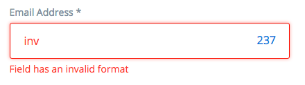
In this example, a valid email is the only correct input.
Restricting field length
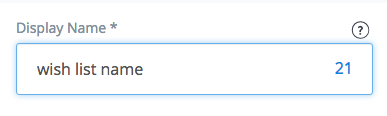
With the max-character attribute, you can specify how many characters the user can type into a field. The attribute accepts a positive integer number as the value.
<input type="text" name="Wishlist Item Name" builder-input="noRestriction" class="form-control input-lg" ng-model="wishlistItem.name" required max-character="35"></input>
Custom validation rules
If you want to use custom validation rules, you need to define them first. Use inputValidator.addValidator to do it. Define the name of your rule, the regular expression representing the valid field's pattern, the regular expression representing allowed characters, the minimum and maximum allowed field length.
inputValidator.addValidator(name, formatRegex, characterRegex, minLength, maxLength);
For example, use the following call in your controller:
$scope.save = inputValidator.triggerValidation.bind(inputValidator);
inputValidator.addValidator("phoneNumber", /\(?([0-9]{3})\)?([ .-]?)([0-9]{3})\2([0-9]{4})/, null, 3, 35);
If you want to add a helpful hint text for the input field, use the inputValidator.addHintTextTranslations in your controller:
var translatedHintText = "Use digits, brackets () and hyphens -";
inputValidator.addHintTextTranslations("phoneNumber", translatedHintText);
In the view, define an input field and use your custom validation rule name as the builder-input attribute :
<input type="text" name="User Phone Number" builder-input="phoneNumber" class="form-control input-lg" ng-model="user.phone" ></input>

Builder First Contact Tour for Navigation Nodes
Using the Builder first contact tour for navigation nodes, you can define a step-by-step walkthrough for the navigation nodes of your Builder module that displays whenever a user enters a project with the module for the first time. This helps to orient new users and improves their user experience in the Builder.
In this tutorial, you will learn more about how to define the first contact tour for the navigation nodes of your Builder module.
First contact tour structure
The first contact tour consists of a series of steps. Each step describes one particular navigation node. Optionally, you can define an introductory step that is not bound to any navigation node and is shown as a first step of the tour.
Tour steps in the module.json file
In order to use the first contact tour functionality, you must define your tour steps in the module.json file of your Builder module. Each step is defined by a tourStep element:
{
      "tourStep": {
          "heading": "main.head",
          "text": "main.text"
      },
      "widgets": [
          {
              "id": "wishlist#1",
              "title": "Wishlist",
              "settings": {
                  "description": "Main widget for the Wishlist.",
                  "viewUrl": "/#!/wishlist/",
                  "required": true
              },
              "tourStep": {
                  "heading": "wishlist.head",
                  "text": "wishlist.text"
              }
          },
          {
              "id": "wishlist#3",
              "title": "Wishlist Settings",
              "settings": {
                  "viewUrl": "/#!/administration/settings/"
              },
              "tourStep": {
                  "heading": "settings.head",
                  "text": "settings.text"
              }
          },
          {
              "id": "wishlist#4",
              "title": "Favourite Wishlists",
              "settings": {
                  "viewUrl": "/#!/administration/favourite/"
              },
              "tourStep": {
                  "heading": "favourite.head",
                  "text": "favourite.text"
              }
          }
      ],
      "translations":{
          "en" : {
              "wishlist#1" : "Wishlist",
              "wishlist#3" : "Wishlist Settings",
              "wishlist#4" : "Favourite Wishlists",
              "main.head" : "Welcome to the Wishlist Module",
              "main.text" : "Take a quick walkthrough to familiarize yourself with the Wishlist module.",
              "wishlist.head" : "Wishlists",
              "wishlist.text" : "Here you can search for, view, and manage your wishlists.",
              "settings.head" : "Settings",
              "settings.text" : "Here you can manage the Wishlist module by applying diverse settings.",
              "favourite.head" : "Favourites",
              "favourite.text" : "And, last but not least, here you can find and manage your favorite wishlists."
          }
      }
}
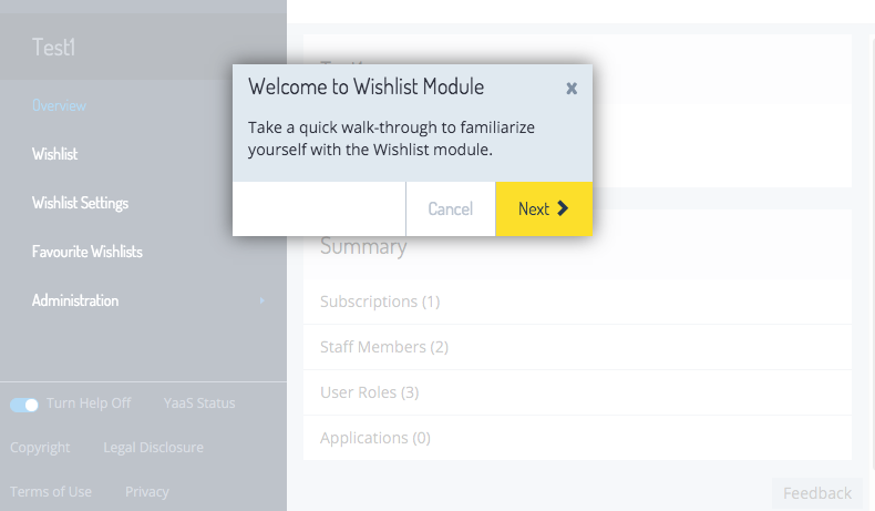
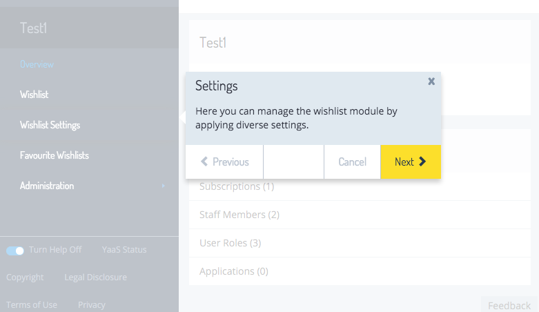
You can see the introductory module-level tour step at the top, and then a separate tour step is included on each navigation node. The headings and texts of these tour steps are localized. The heading and text attributes contain localization keys and the real texts are in the translations section of the module.json file.
Screenshots
These images show how the tour looks in the Builder, for both the introductory step and a navigation node step.
Introductory step:
A step describing the navigation node:
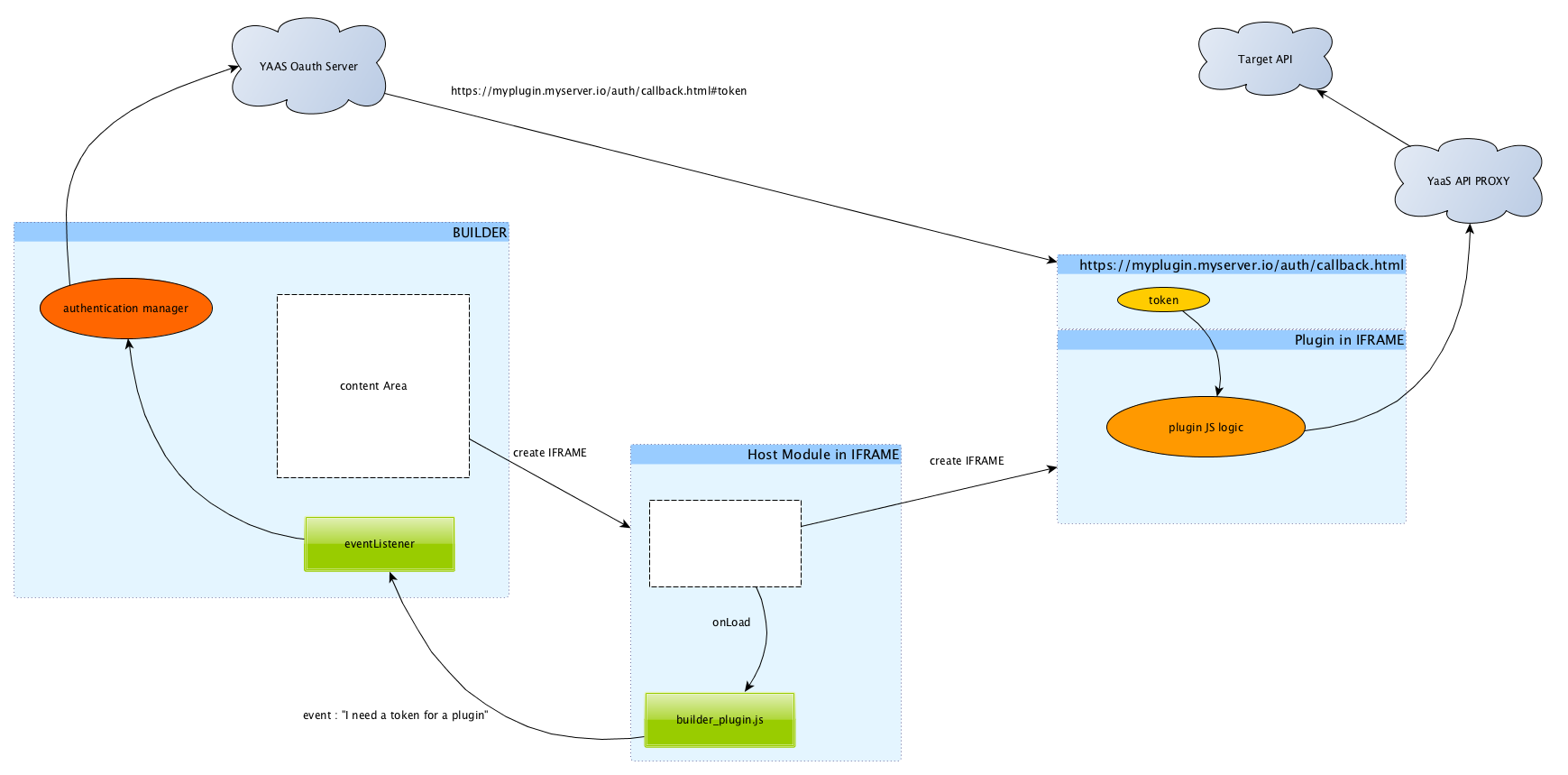
Builder Module Extensibility
After you have implemented, deployed, and published your Builder UI module, it is visible in the Builder for tenants who subscribe to the package containing the module. In other words, the basic functionality of the Builder can be extended with additional modules when tenants subscribe to the related packages. The following image illustrates the extension.
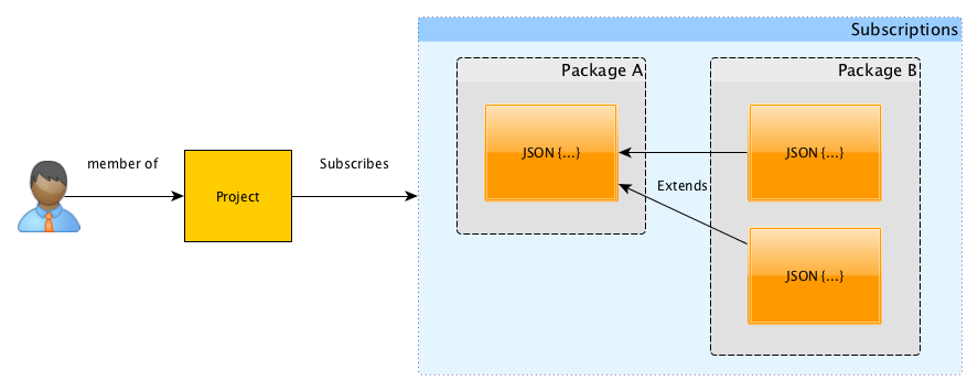
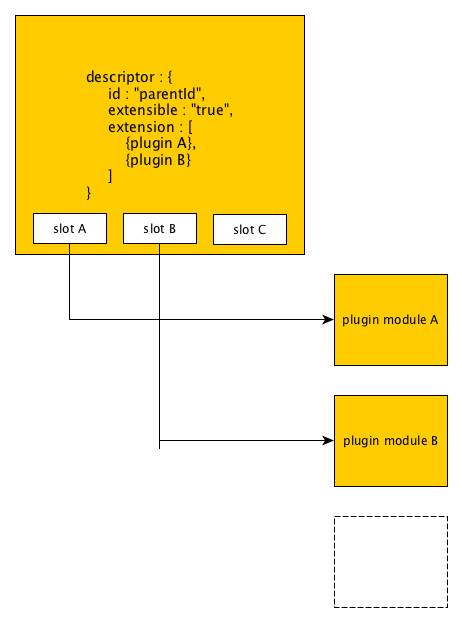
The concept of extensibility applies not only to the Builder, but also to the Builder modules themselves. It's possible to extend Builder modules by means of plug-ins. For example, imagine a user subscribes to "package A". This action enables the Builder "module A". Module A contains an extension point called "slot A". The subscription to module A also triggers the declaration of an extension point in "slot A". Now, when the user subscribes to a "package B" that has a plug-in Builder module defined for display in module A, slot A, the extension point of slot A enriches module A with a plug-in from module B.

Create a host module
To embed plug-in modules, start by defining the host module. The host module is basically a regular Builder module that defines the slots for the plug-ins.
You can create a new host module from a template using the createModule command of the Builder CLI. Just select uiExtensibilityHost from the list of available templates.
$ builder createModule host

Available templates:

0. simple - Only the bare minimum needed for a Builder module
1. demo - Contains many examples of various features
2. list - A view displaying a list, already prepared for making calls to an API via Restangular
3. uiExtensibilityHost - Contains a view capable of including plug-in modules
4. uiExtensibilityPlugin - Plug-in module example
The generated files exhibit some new features compared to a simple Builder module:
- Metadata in the module.json file declares this module (extensiblemodule) as
extensible : nested. Thenestedvalue indicates that plug-ins can be nested in the predefined slots of the host template. - The index.html file includes the builder_plugin.js file, which is a dedicated JavaScript API to enable integration with plug-ins.
- The index.html file contains an extension slot. One of the span elements is named as an extension slot (slot1) using the builder-extension-slot attribute.
- The .js file uses the supporting API: BuilderExtensible.
Create a plug-in module
To create a plug-in module, use the createModule command of the Builder CLI. Select the uiExtensibilityPlugin from the list of available templates.
Generated files of the plug-in module also contain some features related to the extensibility mechanism:
- Metadata in the module.json file declares that this module is a plug-in because it is extending slot1 of the extensiblemodule.
- The auth.html file was generated to serve as a dedicated resource that captures the access token for the plug-in after successful authorization.
- The plugin.html file includes the builder_plugin.js file, which is a dedicated JavaScript API, to enable integration of the plug-in module with host.
- The .js file uses the supporting API BuilderPlugin.
Builder module plug-in integration
When the user opens a project in the Builder, the system examines all of the subscribed packages that the project contains. Then, the included modules become available in the Builder's navigation. Next, the system combines all of the subscribed plug-in modules with matching subscribed hosts, so that when the host module displays to the user, the Builder already knows all of its currently available extensions and assigns them to their target slots.
Context of the plug-in module
Even though a plug-in module is embedded in the host module, it doesn't share the authorization context with the host. Plug-ins have their own, completely isolated authorization context, which is not accessible by the host module (and vice versa). When the Builder examines the available module plug-ins, it issues an authorization request for each of them, requesting scopes as defined in the module definition. The authorization success redirection is captured by the plug-in (via a dedicated resource hosted by the plug-in, /builder/auth.html) so that it keeps the access token private.
Host initialization
When the host module is loaded, it calls:
BuilderExtensible.injectExtensions();
As a result, an iframe element is appended to every extension slot for which a matching available plug-in module was found. The plug-in module's documents are loaded in those iframes.
Plug-in initialization
When the plug-in module is loaded in the iframe, it declares a callback function that should be called when the context of the plug-in is ready:
 BuilderPlugin.ready(function() {
        $scope.token = BuilderPlugin.authorizationData.accessToken;
        $scope.scope = decodeURIComponent(BuilderPlugin.authorizationData.scope);
        $scope.tenantId = BuilderPlugin.authorizationData.tenantId;
        $scope.clientId = BuilderPlugin.authorizationData.clientId;

        //do what you need to do once the plug-in has its context ready...
    });
Additionally, when the plug-in's document within the host's slot is ready, the plug-in sends an event to the host informing it about the resulting height and width. This way, it requests a resize operation of its target slot so that it fits the plug-in.
General purpose events
You can use events to transfer data between the host and plug-ins, in both directions.
Here is an example of how to send an event from a host module to all the plug-ins that extend it:
BuilderExtensible.sendEvent('myHostEvent', data);
Here is an example of how to react on the event in the plug-in module:
BuilderPlugin.on('myHostEvent', function(data) {
    // myHostEvent callback function
});
Use the following example to transfer data from the plug-in to the host:
BuilderPlugin.sendEvent('myPluginEvent', data);
Use the following example to react on the event in the host module:
BuilderExtensible.on('myPluginEvent', function(data) {
    // myEvent myPluginEvent function
});
Register host and plug-in modules
Extensible hosts and plug-in modules must be registered in YaaS just like all other Builder modules. So, after you have implemented and deployed them, use the Builder to register the modules in YaaS. Include the hosts and plug-in modules in the target packages that your project provides.
Defining a host module is no different from defining any other Builder module. When registering a plug-in module, you should complete the same tasks as for other modules:
- Provide a URL for the module.json file where it was deployed.
- Specify what the plug-in can do on behalf of the tenant (the authorization scopes of the module), but pay special attention when defining redirect URIs.
- Make sure that you define the redirect URI for the plug-in:
https://{baseURL of your plug-in}/builder/auth.html. This endpoint is important for the plug-in to capture the access token that was granted for its authorization context.
The image below illustrates the process of plugin authorization:
Control slot size
Because all plug-in modules are not the same size, you need the ability to adjust the size of the iframe in which the plug-in fits. For example, a plug-in that displays product ratings might require more space than one that simply displays a single button.
This example shows a function that resizes a plug-in and then triggers a resize request so the host module can react.
$scope.big = function() {
 $("body > div").css("height","600px");
 $("body > div").css("width","500px");
 BuilderPlugin.requestResize();
    };
The function requestResize is included in the builder_plugin.js file. After you set the dimensions for the
The function requestResize automatically runs upon initialization of the plug-in module.
How to implement widgets for the Project Dashboard
Widgets make retreiving data simple. They are the ideal tool for both developer and business user to obtain a quick glimpse of key information affecting their perspective tasks. The flexibility that widgets offer make it easy for developers to customize widgets to the needs of their project. Business users avoid an extended search for information found after several clicks.
This tutorial is a guide to creating a widget that shows the total number of email templates. Familiarize yourself with the requirements and accessibility of your widget before following the steps to generate the necessary files for development.
Requirements
Access to velocity templates
To fetch and visualize the data, the widget needs to access the velocity templates service. This means that the project using the widget needs to have permission to use this endpoint: https://api.us.yaas.io/hybris/velocity-template/v1.
A subscripton to the email package
Before starting the implementation, make sure that your project has a subscription to the email package.
Subscribing to package from different markets gives you access to services deployed in different regions. In this guilde, we assume that the subscription is on the US or BETA market. If your subscription comes from the German market, consume data for the EU region.
Who can use widgets that I implement and deploy?
Your widgets is visible:
- in your project if it is developed and registered as a builder module in the same project.
- to all projects subscribed to the package containing the widget.
Which resources can a widget access?
- A widget can consume any services accessible to the project that the widget is used in. Accessible services can be ones originating from subscriptions or from your own development.
- Scopes defined for a widget restrict data access according to the same rules as those that apply to regular builder modules.
Generate files
From a technical point of view, a widget is a builder module. So, use the Builder CLI to create a new builder module.
Run the command
$ builder createModule widgetfrom a command line.$ builder createModule widget Available templates: 0. simple - Only the bare minimum needed for a builder module. 1. demo - Contains many examples of various features. 2. list - A view displaying a list, already prepared for making calls to an API via Restangular. 3. uiExtensibilityHost - Contains a view capable of including plugin modules. 4. uiExtensibilityPlugin - Plugin module example. 5. projectDashboardWidget - Project Dashboard Widget example.Select Option 5.
Provide some details about the data your widget consumes. Indicate the API from which your widget consumes data.
 Please enter name for your widget.
 > Velocity Templates Count
 Please enter base url of the service for your widget.
 > https://api.us.yaas.io/hybris/velocity-template/v1
 Please enter resource for your widget to consume.
 > /templates
Inspect the generated files. The files are:
- the widget view (widget.html) and the controller (widgetApp.js)
- the module descriptor (module.json)
- auth.html. This file gives the widget the ability to consume its own authorization context
- manifest.yml and nginx.conf support deployment
Implement the view and the controller
Implement the view and the controller so that your widget consumes the endpoint https://api.us.yaas.io/hybris/velocity-template/v1/{currentProject}/templates and shows the total count of velocity templates defined in the current project.
widgetApp.js
    angular.module('widgetApp', ['builderPlugin'])
    .controller('WidgetCtrl', ['$scope','Restangular',function($scope, Restangular){
        $scope.totalCount;
        BuilderPlugin.ready(function() {
            $scope.currentProjectId = BuilderPlugin.authorizationData.tenantId
            Restangular
                .setBaseUrl(BuilderPlugin.settings.serviceBasePath)
                .withConfig(function(RestangularConfigurer) {
                    RestangularConfigurer.setFullResponse(true);
                })
                .one($scope.currentProjectId+"/templates?pageSize=1&pageNumber=1&totalCount=true") // append &totalCount=true if you need totalCount in the response
                .getList()
                .then(function(response){
                    $("#spinner").remove();
                    $scope.totalCount = response.headers("Hybris-Count");
                },function(error){
                    $("#spinner").remove();
                    //handle error
                });
        });
    }]);
widget.html
    <!DOCTYPE html>
    <html>
        <head lang="en">
            <meta charset="UTF-8">
            <!-- custom stylesheets -->
            <link href="https://builder.yaas.io/public/css/styles.css" rel="stylesheet"/>
            <script src="https://builder.yaas.io/public/js/vendor/jquery/dist/jquery.min.js"></script>
            <script src="https://builder.yaas.io/public/js/vendor/underscore/underscore.js"></script>
            <script src="https://builder.yaas.io/public/js/vendor/angular/angular.js"></script>
            <script src="https://builder.yaas.io/public/js/vendor/restangular/dist/restangular.js"></script>
            <script src="https://builder.yaas.io/public/js/builder_plugin.js"></script>
            <script src="js/widgetApp.js"></script>
            <title>Widget</title>
        </head>
        <body class="widget-wrapper" ng-app="widgetApp">
            <div class="panel panel-default" id="spinner">
                <div class="panel-body">
                    <div class="spinner">
                        <div class="spinner-container spinner-container1">
                            <div class="spinner-circle1"></div>
                            <div class="spinner-circle2"></div>
                            <div class="spinner-circle3"></div>
                            <div class="circle4"></div>
                        </div>
                        <div class="spinner-container spinner-container2">
                            <div class="spinner-circle1"></div>
                            <div class="spinner-circle2"></div>
                            <div class="spinner-circle3"></div>
                            <div class="circle4"></div>
                        </div>
                        <div class="spinner-container spinner-container3">
                            <div class="spinner-circle1"></div>
                            <div class="spinner-circle2"></div>
                            <div class="spinner-circle3"></div>
                            <div class="circle4"></div>
                        </div>
                    </div>
                </div>
            </div>
            <div sizeElement class="widget-container" ng-controller="WidgetCtrl">
                <h4>Number fo templates</h4>
                <h1 class="numbotron-value">{{totalCount}}</h1>
            </div>
        </body>
    </html>
Run the widget locally
Run the widget locally using the command line interface.
$ builder runModule
Go to https://localhost:8081/builder/module.json in your browser and accept the security exception.
Register local instance of your widget
Defining a widget Builder Module is no different from defining any other Builder module. When registering a widget module, you should complete the same tasks as for other modules:
- Provide a URL for the module.json file indicating where the file was deployed.(For a locally running widget, use
https://localhost:8081/builder/module.json) - Specify what the module can do on behalf of the tenant. In this case, required scopes are hybris.email_view and hybris.velocitytemplate_admin.
- Make sure that you define the redirect URI for the widget:
https://localhost:8081/builder/auth.html. This endpoint is important for the widget to capture the access token that grants its authorization context. - Enable 'Use this Builder Module for my project' option do enable the widget in your project.
Review the widget
Go to your project dashboard and check that your widget is available in your project.
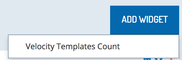
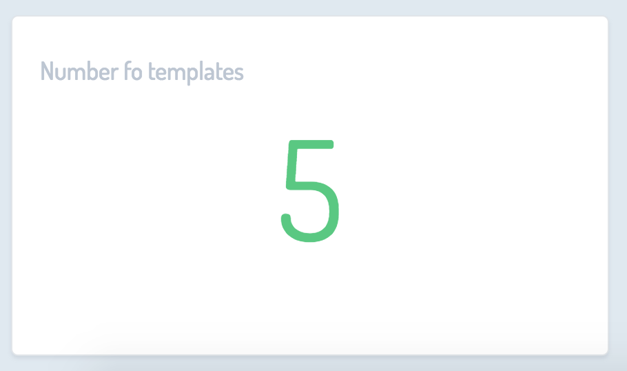
Now you can deploy the widget to a remote location. Once you deploy it, go to the builder module definition and adjust the URLs so that they point to the remote deployment location:
https://{baseUrl of your widget}/builder/auth.htmlhttps://{baseUrl of your widget}/builder/module.json
Resources
Builder resources
Builder resources don't have any version assigned, so the files are always up-to-date.
| Name | Path | Comments |
|---|---|---|
| builder.js | https://builder.yaas.io/public/js/builder.js | |
| styles.css | https://builder.yaas.io/public/css/styles.css | YaaS styles |
Relevant external dependencies
External dependencies are optional. It is recommended to use the versions of Angular and Restangular, which are compatible with the ones used by the Builder.
| Name | Version | Path |
|---|---|---|
| angular | 1.2.18 | https://builder.yaas.io/public/js/vendor/angular/angular.js |
| restangular | 1.3.1 | https://builder.yaas.io/public/js/vendor/restangular/dist/restangular.js |
If you find any information that is unclear or incorrect, please let us know so that we can improve the Dev Portal content.
Use our private help channel. Receive updates over email and contact our specialists directly.
If you need more information about this topic, visit hybris Experts to post your own question and interact with our community and experts.